
The Shockingly Simple Rebrand

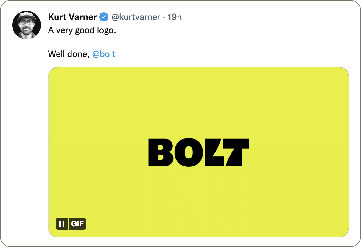
The logo

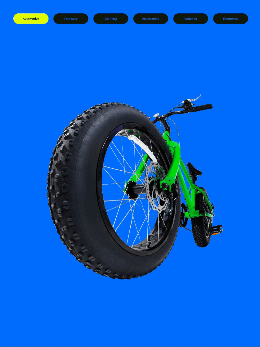
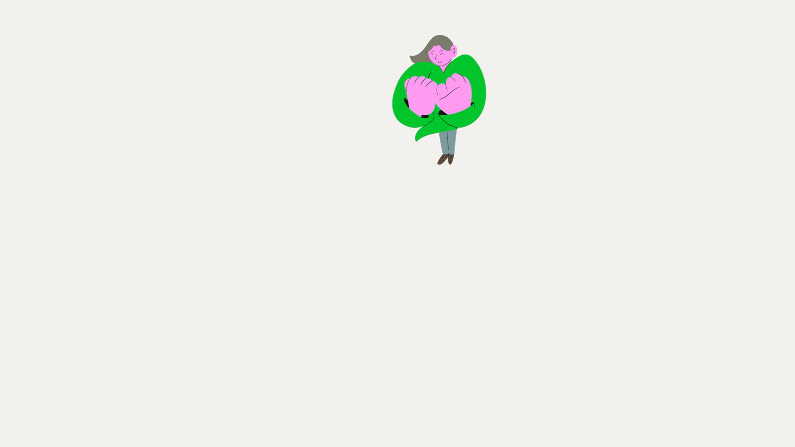
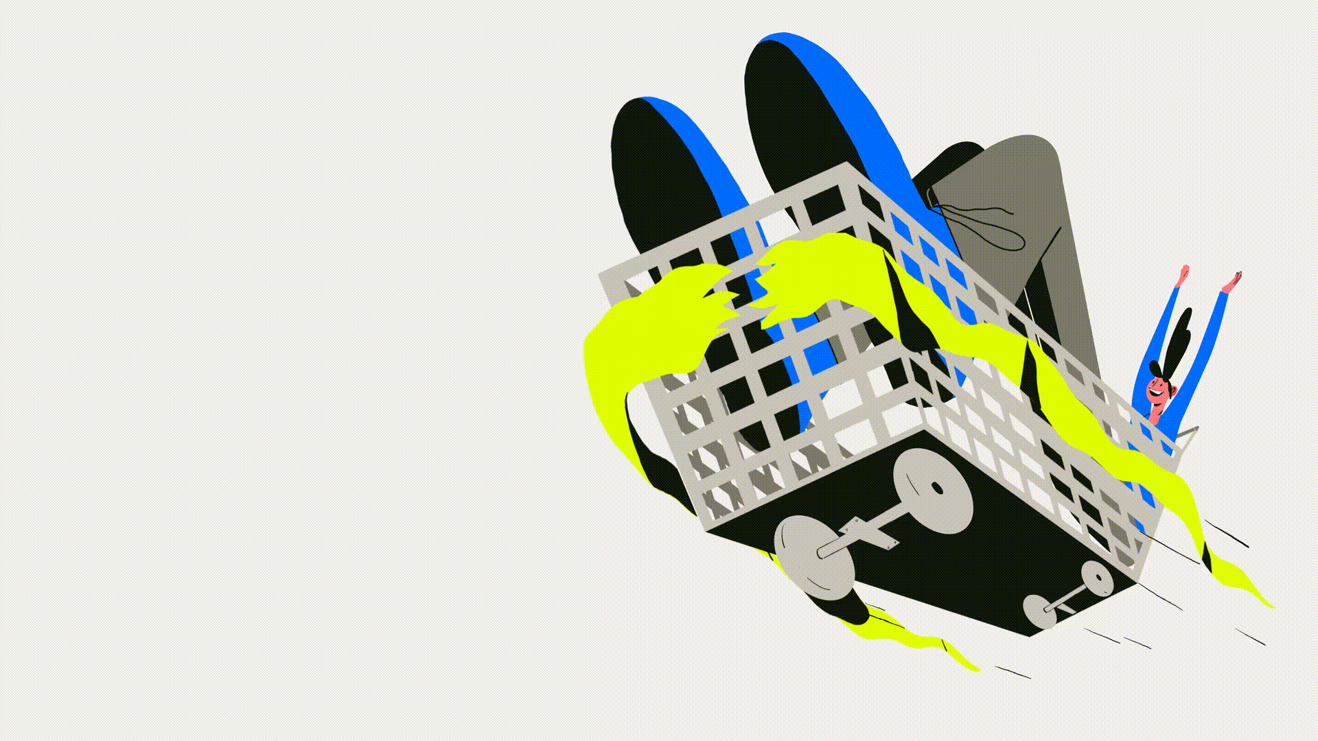
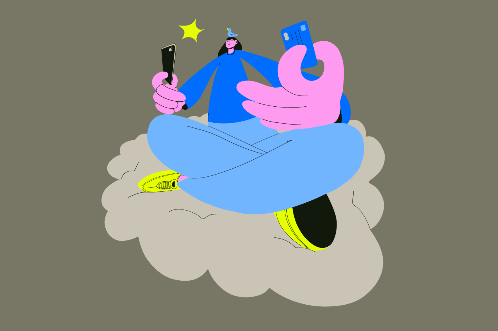
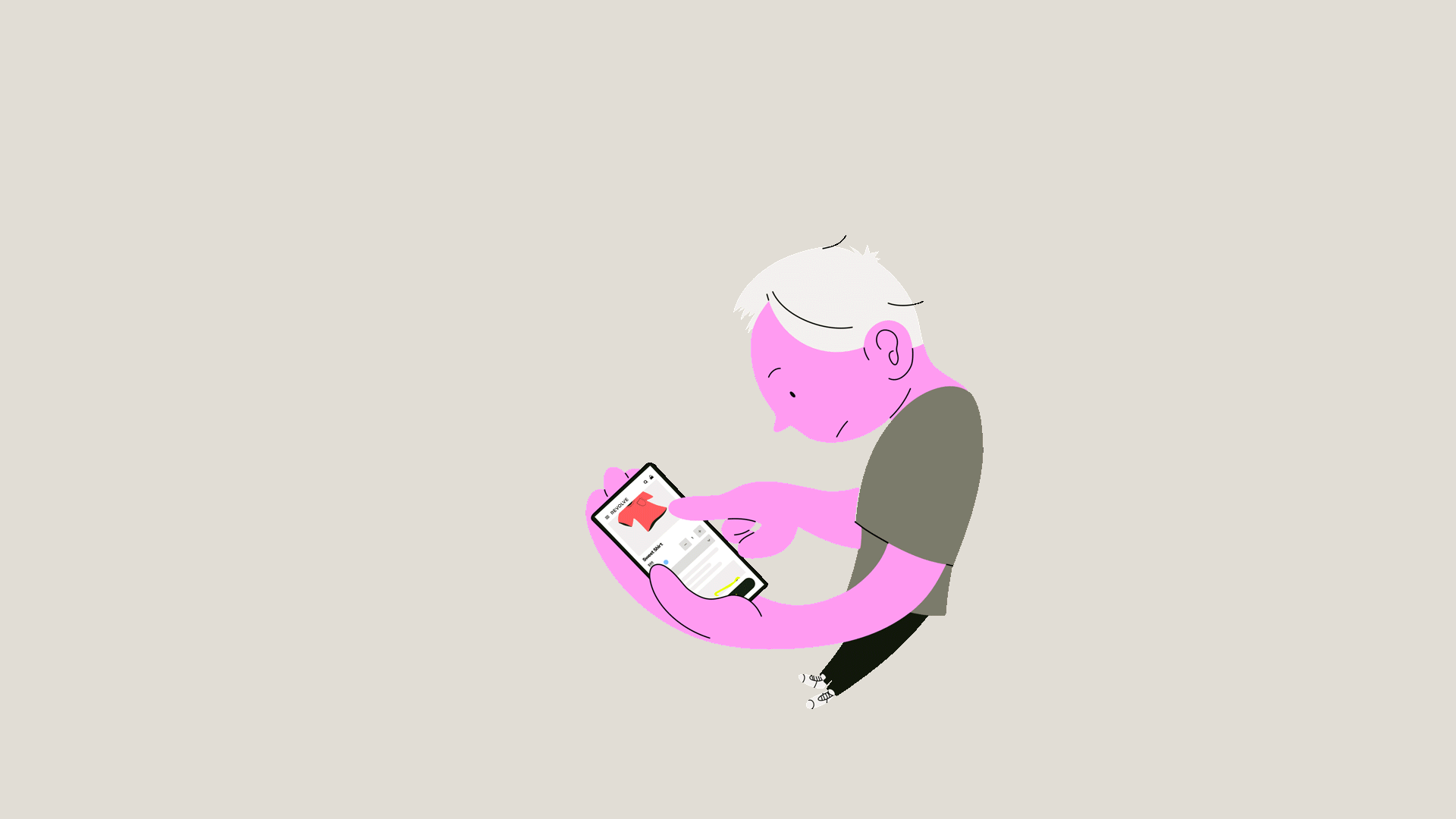
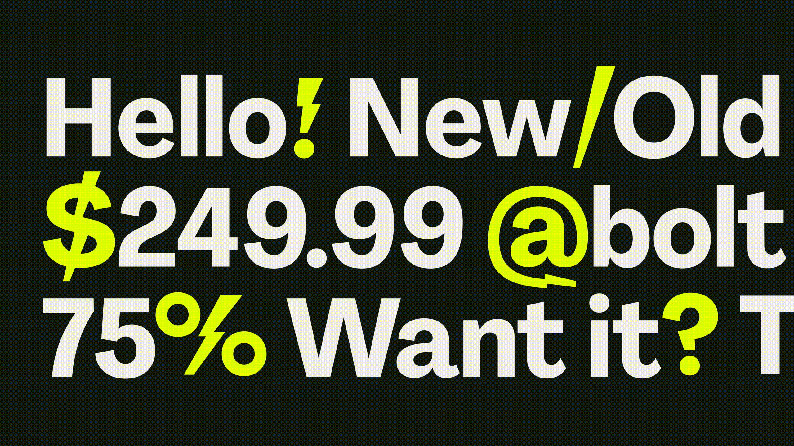
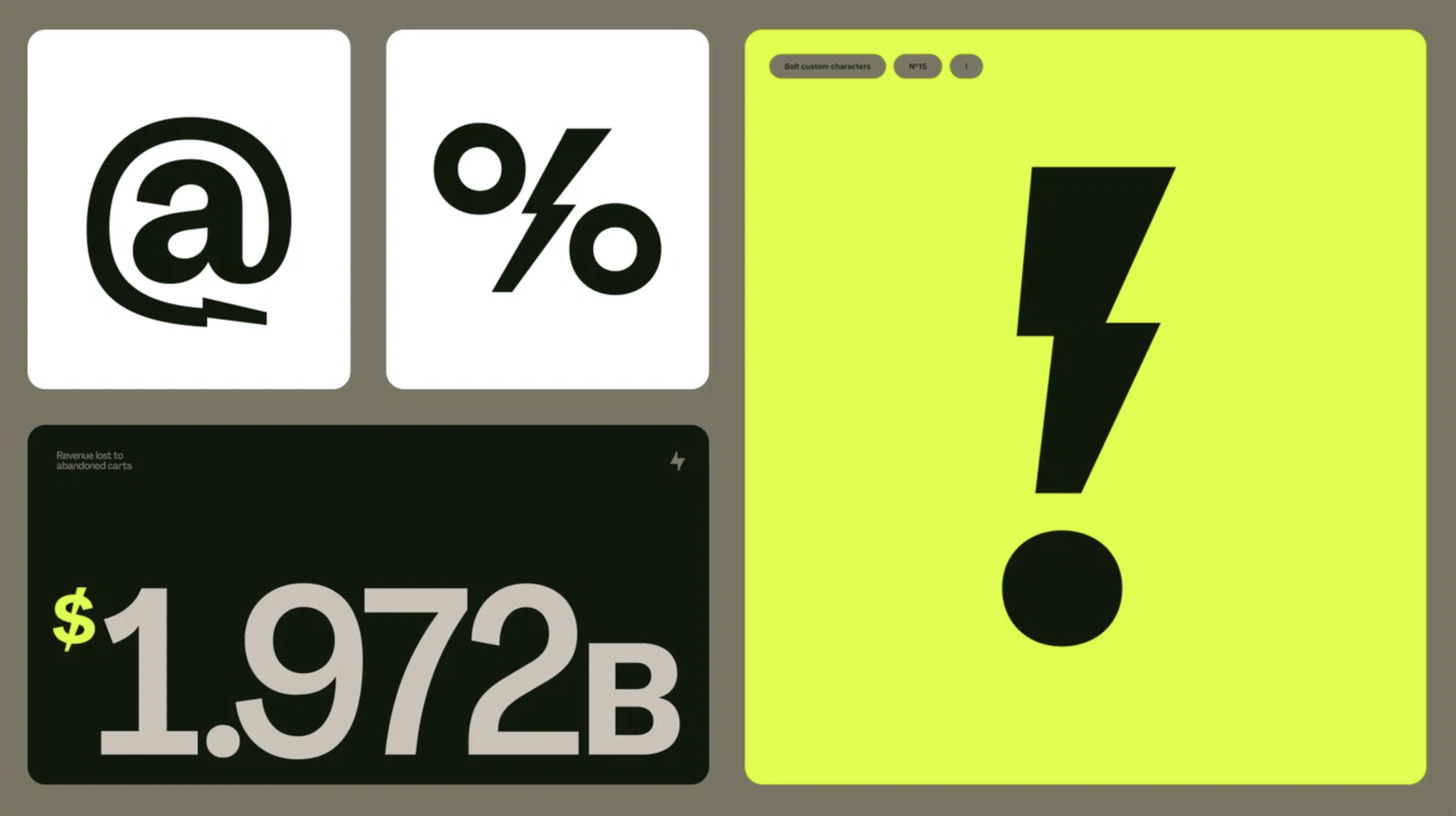
Electric Dynamism
We created a distinct art direction style to be used in our photography and illustrations. We call this style “Electric Dynamism.” It conveys the excitement of One-Click Checkout through dramatic wide angle forced perspective, energetic movement, and a slight surreality that plays off of metaphors of Bolt value props. It’s built out of our color palette, and meant to mimic the momentum and instantaneity of our product experience in a shockingly refreshing way.
We also teamed up with the talented Jack Fletcher as our sole adjunct illustrator.


Boltify everything


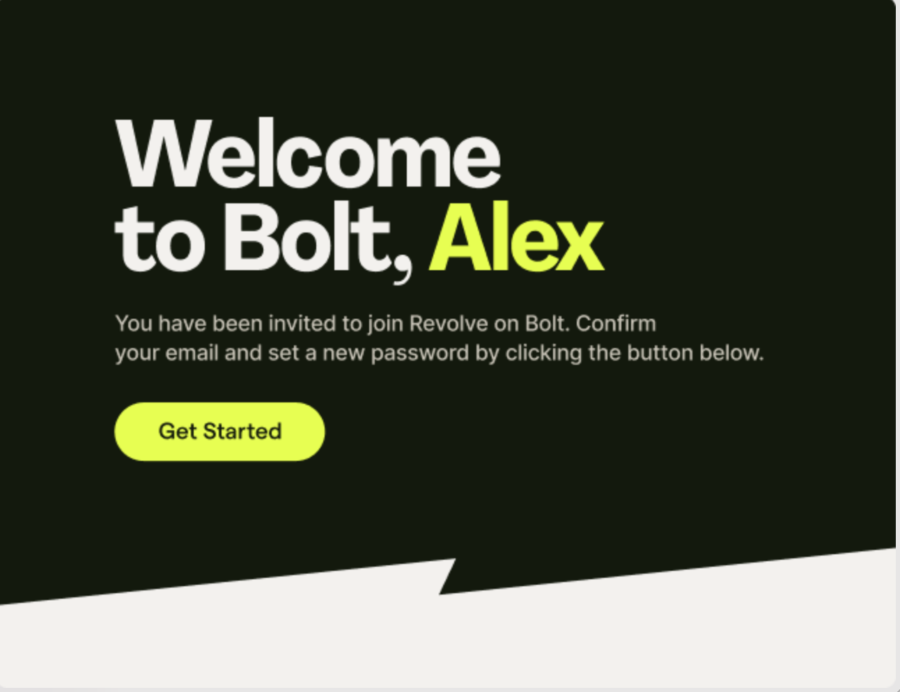

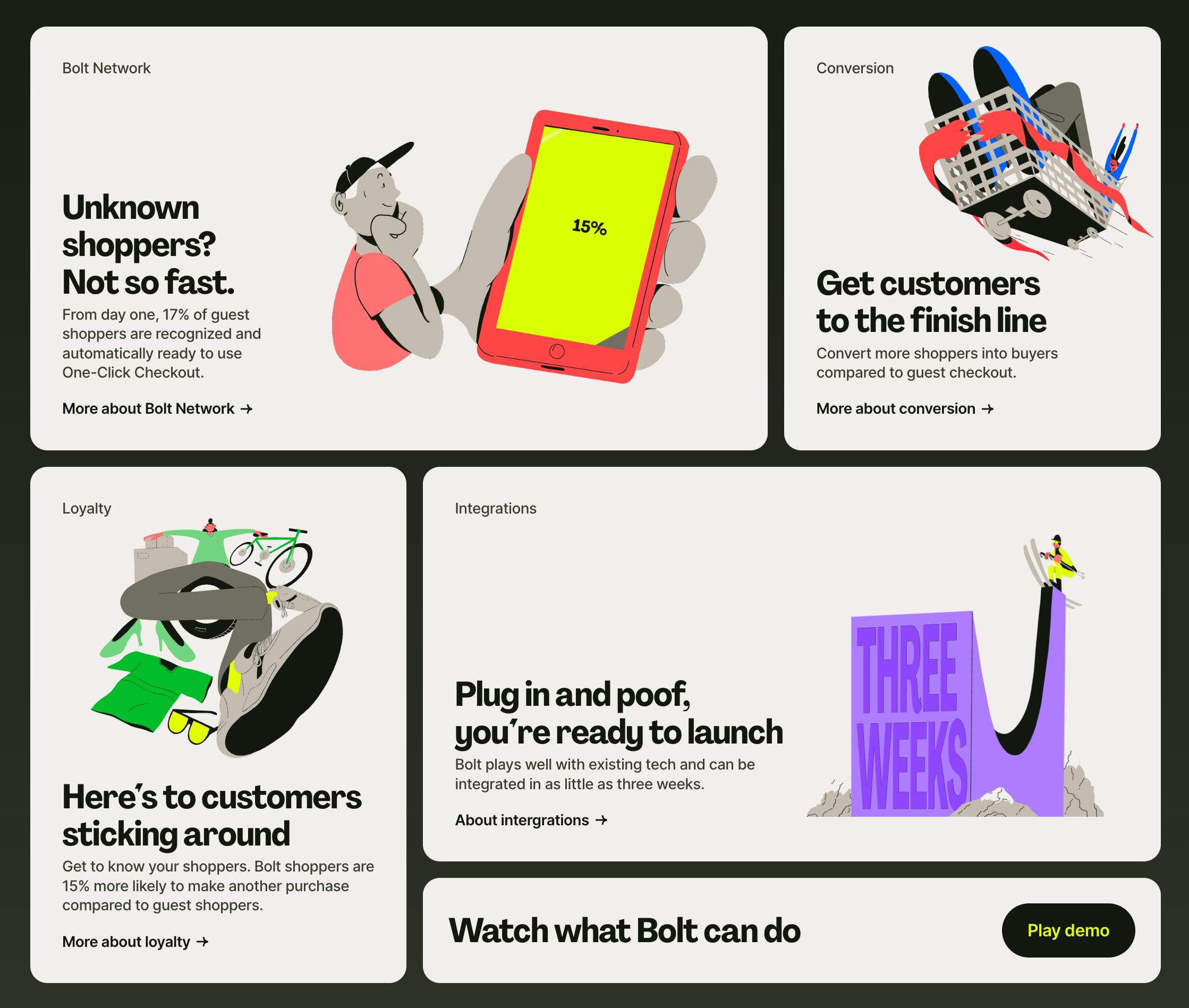
Where it all comes together
All the details finally come together on a complete refresh of Bolt.com. We started from scratch, designing and writing it from the ground up.


The design community noticed
We absolutely loved that all the small details didn’t go unnoticed.


It was also an honor to be asked by Arthur Foliard, Creative Director at Koto Studios, to join The Follow-up podcast. It was a humbling experience to be part of a podcast I’ve followed for years.
Listen here